Saturday 10 May 2014

Visual Presentation - Mood Boards

What is a mood board?

A mood board is typically a combination of images, fonts, colors, and textures that define the style of the project. It is a tool for creatives and clients to come to an agreement about style. They come in many forms and they might even be called something different depending on the industry that you’re in. I’ve seen mood boards show up in fashion, film, photography, branding, web design, wedding planning, interior decorating etc. and they all have different ways of laying out their graphics.
Some of the key points to consider: Layout, format, color, typography, and texture.

Layout

a_3x-horizontal
1. It’s a one page document. If you’ve got pages and pages, you start to dilute your style. Find only the BEST images that represent your style and stick with them. The rest is fluff.
2. It’s the sum of it’s parts. How you order and display your images speaks just as strongly about the mood as the images themselves.
Going For The Structured Look?
Some digital mood boards are very structured and gridded. They usually have less images than a collage type mood board, which makes every image even more essential to telling the story. They also have a very “finished” look about them.
Do: Have consistency. If you want borders, make the same sized borders around every image. The first sign of a non-designer mood board is having some images closer to each other than other.
b07c6a4c6c6d718f2ce8e74207a79781
Do: Line images up. I’ll never forget my layout teacher grabbing a ruler and making sure that everything on my page lined up some how. When you see bad design, Most people won’t know why they don’t want to look at it, but subconsciously what’s happening is that their eyes (and brain) are working extra hard to make sense of things that are almost aligned, too close, or nonsensical. A lot of it has to do with gestalt principles, but just take my word for it: if you’re going for order, commit to it and line your stuff up.
e9fdfda48ba41c37a83f83cc09c3bcdf
Do: Experiment with different shapes! I’m seeing more and more geometric looking mood boards and it adds a lot of interest.
How About Collage Style?
Other mood boards are more freeform; they over lap, they have inconsistent borders, and they are usually coming from all different sorts of media, but they can be all digital too. This is more like a collage and gives off a “hand-made” or chaotic feel. It also makes it feel more like a “process” and less of a “finished piece” like the structured examples. Fashion design uses this method a lot when covering new trends or designing a new line.
2008grn430
Ethnic-e1300152056201

IdeaJournalCloseup

Do: Consider who’s seeing and using the board. If  it’s just for you, putting it up on your wall or in a sketch book can work, but if you have an entire team of both creatives and business types, a more digital format might be best for sharing.


Format

mood-board-570x806
Digital or physical also influences the style and depends on who needs to see it. I typically see digital mood boards more in wedding planning, branding, and web design.
“Physical mood boards give you an extra tactile element and work best with industries that produce actual objects like fashion and interior design.”
Having physical objects mixed in with images pinned up on a real board feels very rustic and becomes more of a piece of mixed media art, and I think It tells a richer story too. I see this most when working in the physical medium like interior design, event planning, and fashion design.
d74455460dc1e59ed6b73aebafd6c8cf
Do: Choose your objects wisely. Having physical pieces to collage not only means working with different colors and shapes that cast shadows, but also textures (more about that later).
Do: use good lighting to photograph your mood board. You waste all that time and effort putting it together if your photo is dark, blurry, or taken at an unflattering angle. This one is “ok” but it would have been better if half the mood board wasn’t in shade.
5d7a0d62876141a5650b2d223b40942e


Color

Mood Board Final
Color plays an important role in your mood, and thus should be obvious when looking at your entire mood board. The color palette should definitely be defined through the imagery you’re using. If you have a bunch of different images that have all different color schemes, you may need to simplify or go back and find more cohesive images. This can sometimes come organically, when you find a few images that speak to the style you’re looking for and suddenly you notice a common color palette or maybe you know that you want to work in the sunset color palette, and you begin to look for images that suit that. Along with images, you can also include color cards, fabric swatches, or physical items that represent the colors.il_fullxfull.428234821_r861
Blue Moodboard

Typography

moodboard-jpeg
Mood boards don’t always have to be just about images and colors. If typography is a vital part of your styling, you can definitely include font choices. I see this most in branding, web design and sometimes wedding planning mood boards (fonts on invites?) As usual, the fonts must make sense with the rest of the piece.
af44e1cbd77c6a2a6a871fd2c6227d21

TheWeddingLawyer-BrandBoard-SaffronAvenue

Pattern/Texture

ec56691c3117c94b81e6fa874957697f
While color helps define emotion, Pattern and texture help define context. You can gather a lot of information from what kind of textures are going to be used. For example if you see old paper, creme colors, and maybe a damask pattern you might guess that the mood board was for some Victorian era style.  Web design mood boards show patterns and textures that will be used in the styling of the backgrounds, the buttons, and the graphics. It’s important to define those early on so that the client doesn’t approve the work because they hate the particular texture you used. Because Fashion and interior design are all about the physical – the perfect polka dot dress or leather arm-chair, showing actual swatches of fabric and patterns is crucial to telling the whole story.
moodboard2
c8b360cc85895134240cd76b9b3b808d
I hope you found this helpful. The main point is to be purposeful and consistent with your layout and image choices and to make sure each image or item helps the story and doesn’t take away from it. Lastly, don’t be afraid to add type and words. Everything can help tell the story.

Source
http://www.creatively-driven.com/the-art-of-the-mood-board/

Supplier Resources- Australian Paint Manufactures Federation

Australian Paint Manufactures Federation


The Australian Paint Manufacturers’ Federation is one of the oldest industry associations in Australia. Its origins date back to the paint and varnish societies which existed in Australia before federation. Today, the APMF represents paint and ink manufacturing companies operating across Australia. In addition, associate members are the suppliers of materials and services to the coatings industry.  Together, the APMF membership accounts for some 95% of all paint manufactured in Australia today!
 
Amongst the current members we can  leading Australian Companies such as:
 Sourced: http://www.apmf.asn.au/index.php?option=com_content&view=article&id=17&Itemid=21

How To Write An Effective Design Brief

How To Write An Effective Design Brief


How do you get the design you want? The perfect design you envision in your head? … The design brief is the answer.
Whether you are a designer or a client, an effective design brief is the single most critical factor in ensuring that a project is successful.
This article will tell you how to write an effective design brief that will be both beneficial to the client and the designer.
This article will be based from the client’s perspective.
What Is A Design Brief?
First off, you may want to know what a design brief is. A design brief is something that is vital to any design project as it will provide the designer(s) with all the information needed to exceed your expectations.
A design brief should primarily focus on the results and outcomes of the design and the business objectives of the design project. It should not attempt to deal with the aesthetics of design… That is the responsibility of the designer.
The design brief also allows you (the client) to focus on exactly what you want to achieve before any work starts on the project.
A good design brief will ensure that you get a high quality design that meets your needs, providing you have  chosen the right designer.
How To Write An Effective Design Brief
If you answer these questions below in an ordered and detailed fashion, your design brief will be 90% done… the other 10% will come from further questions from the designer after you submit your brief.
Have fun answering the questions and remember, provide as much detail as possible! This does not mean one line answers.

What does your business do?
Tip: Never assume that the designer will know anything about your company. Be clear and  concise  and avoid jargon when replying.
  • What does your company / organisation do?
  • What is your company’s history?
What are the goals?  Why?
  • What is the overall goal of the new design project?
  • What are you trying to communicate and why?
  • Are you trying to sell more products or get awareness of your product / service?
  • How do you differ from your competitors?
  • Do you want to completely reinvent yourself or are you simply updating your promotional material?
Tip:  You should also provide old promotional material to assist the designer.
Who is the target market?

  • What are your target market’s demographics & phychographics? ie. the age, gender, income, tastes, views, attitudes, employment, geography, lifestyle of those you want to reach.
Tip: If you have multiple audiences, rank them in terms of importance.
What copy (text) and pictures are needed?
Tip: The copy and pictures used in a design are as crucial as the design itself and you should clearly state who is going to be providing the copy and pictures if needed.  You may need to look into getting a professional copywriter / photographer – ask your designer for some recommendations.
  • What copy needs to be included in the design? Who is providing the copy?
  • What pictures / photographs / diagrams etc need to be used? Who is providing these?
What are the specifications?
  • What size is the design going to be?
  • Where is it going to be printed / used? The web, business cards, stationery, on your car?
  • What other information should the designer know in regards to specifications?
Have you got a benchmark in mind?
  • You should provide the designer with some examples of what you consider to be effective or relevant design even if it is from your main competitors. This will set a benchmark for your designer.
  • Provide the designer with things not to do, and styles that you do not like or wish to see in your design. This will give the designer an idea of what to avoid and will avoid disappointment on your behalf.
What Is Your Budget?

  • Providing a budget prevents designers wasting valuable time and  resources when trying to maximise your budget.
  • Providing the budget upfront also allows designers to know if the project is going to be worthwhile to complete. Make sure you are worth their time.
What is the time scale / deadline?
  • Give the designer a detailed schedule of the project and set a realistic deadline for the completion of the work. You should take into account the various stages of the design project such as consultation, concept development, production and delivery.

Tips For The Designer
As a designer it is important to have a template such as this one to give to clients as clients will not always come to you with a design brief – feel free to use this one as you please. By having a template ready, it shows them your professionalism and ultimately saves them (and you) a lot of time and money.

http://justcreative.com/2008/09/26/how-to-write-an-effective-design-brief/

Designing with Colour

Designing With Color 


Choosing Paint Colours

Click on the above link to watch this helpful video which assists with how to design with color

Visual Perception- Colour Blindness

Color Blindness

Almost 10% of human males experience color vision deficiency (compared with 0.4% of females). The most common form of these abnormalities is characterized by an inability to distinguish between red and green hues.
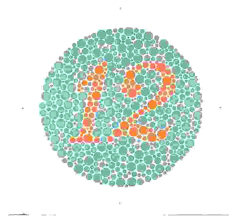
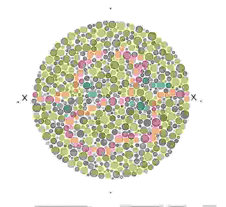
Instructions: The following images are part of The Series of Plates Designed as a Test for Colour-Deficiency by Shinobu Ishihara M.D. which is the accepted standardized color blindness test. They are specially adjusted to isolate the exact deficiency experienced by the viewer. What do you see in the plates?
This is a test plate in which everyone should see a "12". Color Blindess Control
This plate is designed to separate the type of color defectives and the level to which they are observed. Most will see the number "26" clearly while some will only see a "2" or a "6" or no numerals at all. Color Blindness Check
Can you trace a line from one "X" to the other? Someone with normal color vision will trace a orange/brown purple line and those with a slight deficiency will follow a different path. Color Blindness Confirm

Impacts of colour

Impacts of colour


Colour has a profound effect on human behaviour and it is better understood now than at any time in history.
The Colour Affects System of applied colour psychology is built on the pairing of colour physics with psychology to evoke consistently reproducible - and predictable - psychological response to colour in the great majority of people.
Colour affects your bottom line in branding, packaging, web design, interiors, product design and fashion.
Understanding your personal palette and how to surround yourself with your best colours, in your clothes and your home, will make you feel good about yourself and send your confidence soaring. Looking great is an inevitable by-product.


Muted colours considered beneficial
Resene Ming Resene Drover Resene Golden Glow Resene Mexican Red Resene Milk Punch Resene Chetwode Blue
 
        
Resene Puerto Rico Resene Sunglo Resene Tacao      
 
Colours considered too sharp or detrimental
Resene Bunker Resene Grenadier Resene La Rioja Resene Seance ReseneTurbo Resene Yellow Sea
Uplifting bright colours
Resene Cranberry Resene Deep Koamaru Resene Flame Red Resene Lima Resene Moon Yellow Resene Resolution Blue
 
        
Resene Salem Resene West Side Resene Windsor      
           
Darker (but not black) colours
       
Resene Cinder Resene Haiti Resene Midnight Resene Sepia
Soft pastel colours
Resene Blossom Resene Burning Sand Resene Cherub Resene Dutch White Resene Pancho Resene Sandy Beach
 
Resene Perano Resene Spun Pearl Resene Surf Crest Resene Viola Resene Vista Blue Resene Wistful
 
Soft mid toned colours
Resene Astra Resene Au Chico Resene Coral Resene Highland Resene Laurel Resene Mexican Red
           
      
Resene Leather Resene Neptune Resene Pure White Resene Putty Resene Spanish White
General guides to colour self help
 White
  • In its natural form it is daylight.
  • Helps the mind to be open, clear and receptive.
  • Not good if feeling isolated or cut off as it encourages depression and body chills.
Reds
  • Dark and severe reds tend to have the ability to over-stimulate and agitate.
  • Helps with blood pressure, cold hands and feet and hypertension.
Oranges
  • Brighter oranges are very social and gregarious.
  • Deeper oranges like terracottas are very warming.
  • Helps with muscular tension and liver disorders.
Golds
  • Falls between yellows and oranges.
  • Less irritating to the nervous system than yellow.
  • Very beneficial for pain in the joints and arthritis.
Yellows
  • Bright sharp yellows are very tiring and can trigger migraines and travel sickness.
  • Helps tissue renewal and constipation.
  • Soft yellows used with bright blues are good for mental stimulation and growth in children.
Bright Greens
  • Those greens often referred to as Kelly Green are found to energise the central nervous system.
  • Used with clear blues and pure white this type of green encourages physical activity.
Dark Greens
  • Assists blood circulation and helps concentration.
  • Think of the ‘green room’ used by an actor prior to a performance.
Pale Greens
  • Very soothing with anti-stress qualities.
  • Promotes an even and steady heart rhythm and harmony.
Turquoises
  • Between blue and green, helps if there is emotional anxiety or hyperactivity.
  • Useful to balance blood sugar and insulin levels.
Pale Blues
  • Cooling and helps encourage rest.
  • Helps self-reliance.
  • Balance for over-activity.
Dark Bright Blues
  • Immune boosting.
  • Certain types of headaches and bilious stomach-ache can be corrected with this colour.
Indigos
  • It is this deep blue-violet that has been used in medicine bottles over the years.
  • Useful where fear is stopping activity.
  • Sedative.
Mauves
  • Mix of violet and red.
  • Nurturing, promotes intuition, meditative and insightful.
  • Positive effect on the pineal gland.
Magentas
  • Described as blue/pink.
  • Helps with lack of co-ordination, recent shock and excess stress.
  • Darkest hues of this colour are formal and austere and may feel unwelcoming.
Greys
  • Blending of two neutrals.
  • As a mid tone colour it has been used to denote cool rational thinking.
  • Helps heavy metal toxicity.
  • Too much of this colour is demotivating.
Browns
  • Earthy blend of orange, ochre yellow and black.
  • Denotes dependability.
  • Can make individuals feel secure and stable.
  • Darkest form of orange.
Black
  • Black equates to lack of light – night – and is used to rest mind and body.
  • Self-sufficient and hard – it is used during periods of extreme change and trauma.
  • It can be protective and has been used traditionally to signify death and mourning.


 Resources
 http://www.colour-affects.co.uk/
http://www.resene.com.au/homeown/use_colr/coloursforliving.htm